Aaron Douglas' Rebirth and how it fit in with modernist aspects of the Harlem Renaissance Movement.
Paul Renner's Futura and how the font related to the Universal Alphabet of Herbert Bayer, and also why the font was coined the "functionalist strain of modernism."
Kasimir Malevich's Black Square and Russian Suprematism's modernist aspects.
I really would like to write on Douglas' piece so if there's any aspects that you think I can elaborate on for that topic, please let me know.
Sunday, February 28, 2010
Possible Topics
Paul Rand's poster for the film "No Way Out".
Good example of modernism. Discuss his use of
type, illustrations and photography all
in a collage like look.
Joost Shmidt's Bauhaus magazine cover.
Saul Bass, influenced by Paul Rand and the
modernism movement. "The Man with the Golden Arm"
is a possible poster topic.
Good example of modernism. Discuss his use of
type, illustrations and photography all
in a collage like look.
Joost Shmidt's Bauhaus magazine cover.
Saul Bass, influenced by Paul Rand and the
modernism movement. "The Man with the Golden Arm"
is a possible poster topic.
Topics
John Heartfield's use of photo-montage in his anti-Nazi propaganda.
Analyze the effect of Pravda on prop art of soviet Russia, relating Lebedev's work in the 20's to later works in the 30's.
Discuss El Lissitsky's work as a suprematist and contributions to later modernist movements
Analyze the effect of Pravda on prop art of soviet Russia, relating Lebedev's work in the 20's to later works in the 30's.
Discuss El Lissitsky's work as a suprematist and contributions to later modernist movements
Michael Bierut


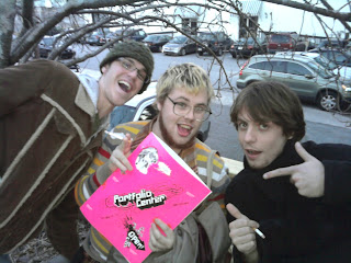
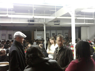
Michael Bierut came to speak at the portfolio center a little more than a week ago and I made sure to be in attendance. Whenever I go see someone speak about graphic design I want to leave feeling super motivated, he did just that. He went through a portfolio of work titled "My life as a Font". Michael took us through a trip of clients hes worked with over the years and presented with a format "A through Z". He was a wonderful speaker and really had the crowds attention the whole time. The biggest thing I took from him was during a part when he was explaining his favorite design in which his daughter was a part of. He said it was his favorite design because he got to work with someone he loved and that he always likes to involve family and close friends if possible in his designs.
*I took the 2 bottom photos while at the portfolio center.
1. American Modernism and its contribution before and after the war(WWII), focusing on the work of Alexy Brodovitch and Herbert Matter with their great contributions to Bazaar magazine and other designs. Bazaar magazine's artists gave great contribution to what we call American Modernism.
2. Bauhaus Movement and the impact of Laszlo Moholy-Nagy, his contribution as making typography a main focus just as much as images, using words in all linear directions to communicate and overall brilliant promotion of the Bauhaus movement itself.
3. The Dutch De Stijl Movent and their focus on universal harmony and asymmetrical relationships. Focusing on Theo van Doesburg and his applications of De Stijl to architecture, sculpture and typography.
Saturday, February 27, 2010
Three Possible Topics
Saul Bass Vertigo Poster places a emphasis on ornament style, which completely shuns the modernism style.
Die Gute Form identifies modernism by using a limited color palette despite the broken forms of the title.
Martin Klosch piece of 1974 emphasizes a vivid drop shadow that brings out the title to the piece, which is more than a modernism aspect.
Die Gute Form identifies modernism by using a limited color palette despite the broken forms of the title.
Martin Klosch piece of 1974 emphasizes a vivid drop shadow that brings out the title to the piece, which is more than a modernism aspect.
Friday, February 26, 2010
Modernism Topics
A.M. Cassandre's poster for L'Intransigeant encompasses the idea of simple use of line, and color in its design making it extremely modern, despite its subject matter clearly resulting from modernity.
A.M. Cassandre pulled on ideas of modernity in his designs, and it shows in his L'Intransigeant poster, but it is also rich in the ideas of modernism with its simplification of the ever-expansive world unfolding at the time.
Drawing much of his inspiration from cubism, McKnight Kauffers poster for The London Underground was a direct example of modernism as it used only the most simple and powerful of images to get a message across.
Wednesday, February 24, 2010
Modernism | Topics
1. Although the 1935 brochure for the Tokyo Imperial Hotel presents a rather detailed depiction of the hotel itself, the simplification of forms as well as the reference to the "white space" seen in Ukiyo-e prints helps solidify this work as an example of modernism.
http://www.travelbrochuregraphics.com/Asia_Pages/asia_6/imperialhotel2.htm
2. Robert Berény takes the notion of simplification to an almost perfect plateau in his 1930 poster for Modiano cigarettes; his simplification of both form and content, he epitomizes the constructs of modernism.
http://img268.imageshack.us/img268/294/modiano1.jpg
3. As the views on advertising changed, governments around the world had to adapt to the most commonly accepted and well-regarded examples of design. The American government released a multitude of advertising campaigns under the Works Progress Administration- a creation of Franklin D. Roosevelt's New Deal that spanned from 1936 until 1941. One of the most notable is the poster that was meant to inspire people to visit their local libraries and read. While this does feature a simplification of form found in many modernist works of the era, it lacks many of the key features such as ambiguity and self-reflexiveness.
http://memory.loc.gov/cgi-bin/query/D?wpapos:3:./temp/~ammem_Slsz::
Note: I can't find a specific artist, so if anyone could help me out, it would be greatly appreciated. If we can't find it, and I have to remove this as an option, that is no problem at all. Thanks!
Three possible thesis statements:
1. In the 1990s ad campaigns, Absolut Vodka’s “Absolut Fax” ad is the epitome of modernist design because of its use of modernist devices such as aesthetic self-reflexiveness, paradox and belief in progress.
2. Cassandre’s “Dubo Dubon Dubonnnet” poster is an acclaimed modernist work due to its use of a simple design layout, holistic design elements and simplification of figures into iconographic symbols.
3. “Olivetti 82 Diaspran” is an example of modernism because of designer Pinteri’s use of modernist devices such as the loss of an integrated individual subject, the reduction of mechanical forms and processes into simplified geometric forms, and the celebration of technology.
Tuesday, February 23, 2010
3 Modernism Topics
I may change some of my topics but since I turned in a work cited sheet my choices are:
1.) Filippo Marinetti "Montage + Vallet + Stadex X Joffre
2.) Fortunato Depero, Cover for Depero
3.) El Lissitzky, Beat the Whites with the Red Wedge
(These may be subject to change)
1.) Filippo Marinetti "Montage + Vallet + Stadex X Joffre
2.) Fortunato Depero, Cover for Depero
3.) El Lissitzky, Beat the Whites with the Red Wedge
(These may be subject to change)
3 Modernism Topics


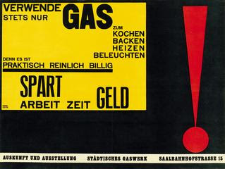
1. Walter Dexel's 1924 poster urging consumers to "use only gas" in the home is an example of modernist design through its use of implied montage, design for design's sake, and ultimately its belief in the betterment of society.
2. In his 1925 poster titled "Homage to a Young Girl," Piet Zwart's use of type placement was typical modernism influenced by modernist experimentation with geometric shape and typographical treatment such as in the work of Schwitter's and Lissitzky.
3. Paul Shuitmea's 1929 advertising leaflet for a manufacturer of machine equipment is an example of modernism in design with its use of aesthetic self reflex, photomontage, san-serif type, ambiguity, and experimentation.
3 topics
John Heartfield's poster attacking the press 1930, though assembled by hand is an example of modern design through montage and the loss of the integrated subject.
Lucian Bernhard's "poster for stiller shoes" simplistic style is consistent with modernism.
By the use of capital letter forms and little concern for bettering humanity, Carlo Carras "Parole in liberta" is not an example of modernism.
Lucian Bernhard's "poster for stiller shoes" simplistic style is consistent with modernism.
By the use of capital letter forms and little concern for bettering humanity, Carlo Carras "Parole in liberta" is not an example of modernism.
Possible Topics
Priester Matches, a print ad designed by Lucian Bernhard in 1906, was instrumental in helping to create what we consider modern graphic design today. It is elegant in its simplicity and is very much a modernist work.
Paula Scher's use of montage in The Best of Jazz poster is a classic example of modernism in design, even most of the type is made up of large, black capital letters.
Day of the Heroic Guerrilla, a 1968 poster designed by
Elena Serrano's grid based design and repeating pattern offer a great example of modernism, despite the pronounced subject, centered on the page.
Possible thesis statements...


1.) Abram Games' poster for "Talk May Kill" is a great example of modernism, even though it lacks paradox, ambiguity, and uncertainty in the design.
2.) Tim Gough's "Siren Fest" for The Village Voice is an excellent representation of modernist work because it portrays the five themes required by Malcolm Barnard.
3.) Siggi Eggertsson's "Live on the Coke Side of Life" uses many elements that suggest modernism, despite his excessive use of ornamentation.
Three Modernist Themes
1. S. A. Jacobs' title page for Christmas Tree, by e.e. cummings, is a definitive example of early American Modernist graphic design by virtue of its cohesiveness and lack of serious political commentary.
2. The movement from early Modern to Modern graphic design can be traced by the comparing the first Bauhaus seal, with its obvious craft and guild associations, and the later Bauhaus seal, which contains simplified forms and geometry.
3. Lewis Carroll's typographic image from Alice's Adventures in Wonderland, from 1866, is a surprising precursor to futurist and, therefore, Modern typography.
Sunday, February 21, 2010
Michael Bierut's "My Life as a Font"
Attending Michael Bierut's lecture was very inspiring for me. With each letter of the alphabet, he named and described the many different businesses he worked with over the past twenty-six years of being a graphic designer. One of the statements that stood out the most was about his daughter telling him that when he started on a new project for a client, all he did was "tweak it a little bit and then take all the credit for it." Although I thought this was pretty hilarious, it also got me to wondering... what is the point of a graphic designer? Is the main purpose to just add on to pre-exsisting ideas and then call it your own? Is there anything original left or is there only room to "tweak" what has already been created? I contemplated over these questions for a while and I believe I came up with an answer. Even though it is hard to call yourself "original" these days, it is possible to create something that can be seen and called yours by adding your own creativeness and knowledge to the work at hand. In this instance, it can be called original. A graphic designer with such caliber like Michael Bierut, makes these circumstances look like a breeze. With as much talent and comprehension of graphic design as he has, Bierut can transform any logo or advertisement into a wonderful composition... even if it means only "tweaking" it a little bit.
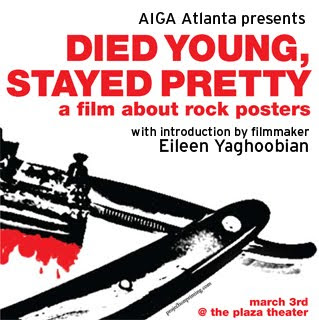
Died Young, Stayed Pretty

Died Young, Stayed Pretty is a candid look at the underground poster culture in North America. This unique documentary examines the creative spirit that drives these indie graphic artists.The film gives us intimate look at some of the giants of this modern subculture. Outside of their own circle, they're virtually unknown. But within their ranks they make up an army of bareknuckle brawlers, publicly arguing the aesthetic merits of octopus imagery and hairy 70s porn stars. Along the way, they manage to create posters that are strikingly obscene, unflinchingly blasphemous and often quite beautiful.
With personal appearance and introduction by the director, Iranian-born Canadian filmmaker Eileen Yaghoobian. This project is the pinnacle of her 12-year career in film and premiered at the 2008 Montreal World Film Festival.
Posters from the film will be on exhibit at the screening.
Location: Plaza Theater
Date: Wed, Mar 3
Time: 7:30 PM - 9:00 PM
Members: $10 online, 15$ door
Student Members: $5 online, 10$ door
Non-Members: $16 online, 20$ door
Friday, February 19, 2010
Kill your babies
Michael Bierut had a problem. He had been working on a design issue and he could not make his solution work. He had tried all kinds of variations. Turning it this was and that, Michael still couldn’t make it fit. After starring at it for what seemed like an eternity, he asked a colleague to take a look. He told her all about the problem and about his great idea that he couldn’t make work.
After looking at his what he had for a while, she said, “Maybe this is a bad idea.”
Kill your babies. I learned this lesson when I took 2-D design at Armstrong Atlantic State University. Don’t be afraid to let go of an idea.
It was refreshing to hear that someone of Bierut’s caliber struggles with the same things that I do.
Michael Bierut’s questions to ask yourself:
What is the story behind what you are working on? What have you learned today? What typeface should you use? What are you trying to communicate? Is it just a bad idea?
Wednesday, February 10, 2010
Friday Syposium Roots and More: African and African American Artistic Legacies
Many notable speakers, including former History of Graphic Design student Shane Thomas who wrote her paper for this class. download full program
Subscribe to:
Comments (Atom)
